Eurovetro Recycling headquarters
The technology and aesthetics of Lapitec sintered stone for exterior cladding.
Eurovetro, the leading company in the glass waste recovery and recycling sector, appointed architect Francesco Renoldli to design and build its new central headquarters in Origgio (Varese), wishing to strongly express its identity and image; the project for the new headquarters was commissioned to mark the creation of a new technological plant considered cutting-edge in both Italy and the rest of Europe. The building’s architecture seeks to symbolise a process, a discipline and quality conduct. The underlying shared idea was to create a clear-cut, meticulous and regimented architectural design that would be solid yet transparent, aiming for a distinctive composition that would bring to mind an almost industrial-like assembly, with a greater focus on technical details rather than aesthetics. Environmental sustainability is the key element at the basis of this project: one covering, three materials. Thanks to its natural properties and potential to also convey architectural inspiration, the designer opted for Lapitec® to clad the entire base of the building, using glass and aluminium to ‘empty out’ the ground floor and design the exterior façades, as these materials are closely linked to Eurovetro’s production process.
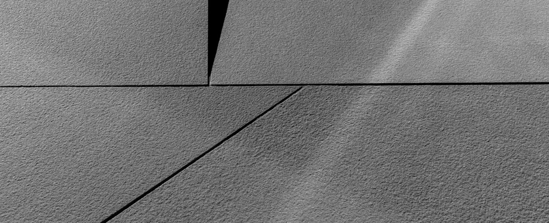
The base made from Lapitec sintered stone, in Nero Antracite with an Arena finish, appears to raise the ground floor, giving it a sense of importance and allowing it to become a seamless connection between the entrances that are at different heights, the aligning features and the building’s volumetric elements. The column that redesigns the outer area of the main entrance has an important presence at the same time as a lightweight appearance: this is the architectural element that joins both the upward section of the floor cladding and the micro-perforated metal surface. To further enhance the monolithic look, slabs were installed stretching from top to bottom, making the most of their maximum technical dimensions of 3440x1540mm. To the side, the tapering that can be seen in plan view creates a sharp edge that lightens the structural mass of the building: the apparent absence of depth from top to bottom really brings out the bare slab, a strong “thread” that is only 12mm thick, on which the entire metal façade appears to rest, presenting Lapitec in its maximum dimensional, and almost abstract, essence.
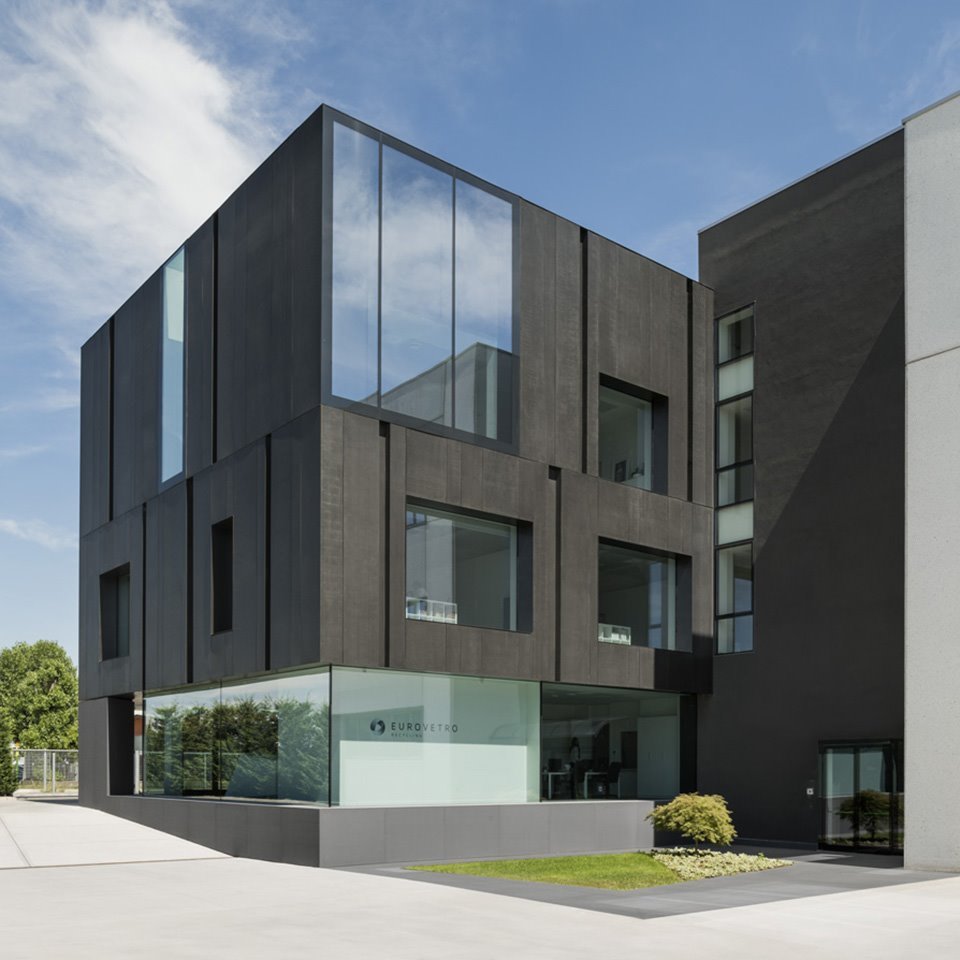
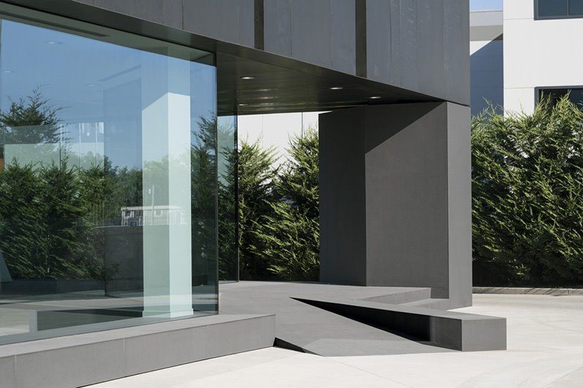
The building's exterior “skin” has a vertical structure that is heterogeneous yet regimented, made up of modular panels with different widths; these panels are made from micro-perforated aluminium, thermo-painted in a dark burnished colour, broken up by recesses to create a sense of movement. Aluminium and Lapitec create the right energy for the glass, defined as a pure element without any hidden structural frames. There are large fixed glass sections defining the ground floor, plus large windows, which were included in the design based on office layout requirements and the architect’s desire to ensure the work areas could enjoy the most natural light possible; these large glass windows further enhance the building’s composition dynamics, playing on filled and empty spaces.
An aesthetic and safe choice.
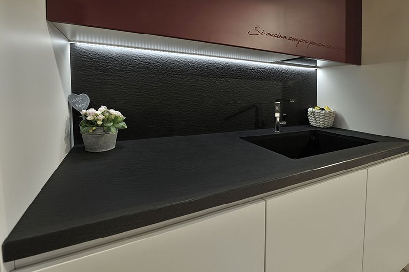
220m2 of 12 mm-thick Nero Antracite Lapitec with an Arena finish cover all of the building’s exterior surfaces, both vertically and horizontally: to express the potential of this material in the best way possible, the slabs were made based on a design layout aimed at getting the most out of the dimensions of the slabs, thereby reducing the need for cutting and joints. The architect chose the Arena finish as it is particularly structured and coarse to the touch; from a technical point of view, it was therefore chosen for safety reasons as it guarantees a non-slip grip that is suitable for being walked on. Nero Antracite is a dark but not too intense shade with grey-blue hints, creating an elegantly “technical” look: the designer wanted to use this colour to bring out the contrast created between the base and the burnished façade and the entire “empty-effect” ground floor, underlining the transparency of the large floor-to ceiling windows. Thanks to its defined colour and coarse yet decidedly consistent finish, the sintered stone chosen highlights the intentional contrasts between the shapes of the building’s base, creating sophisticated texture effects depending on the changing light conditions during the day.
- Building
-
Arena

.jpg)

.svg)